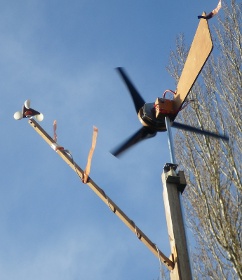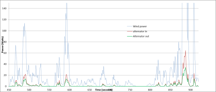
Arduino data logger - Results This was the point where I was hoping to be able to run a turbine design for a few hours, compare the results to previous designs and discover any improvements or changes in performance. The data logger certainly worked but the output wasn't going to be easy to interpret. The readings so far have been taken close to my workshop which is convenient but very sheltered and turbulent. A typical output over time (about 8 minutes) is below showing the gusts of wind and a small turbine (HAWT 0.38 metre radius) generating power into a car battery. The picture on the right shows the set up with the anemometer to one side of the turbine.
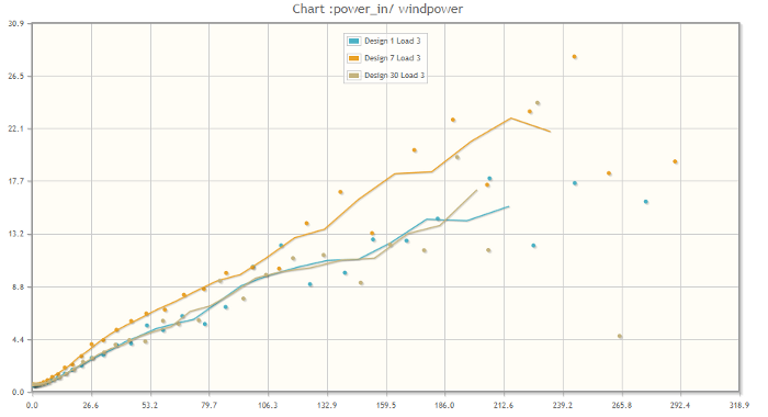
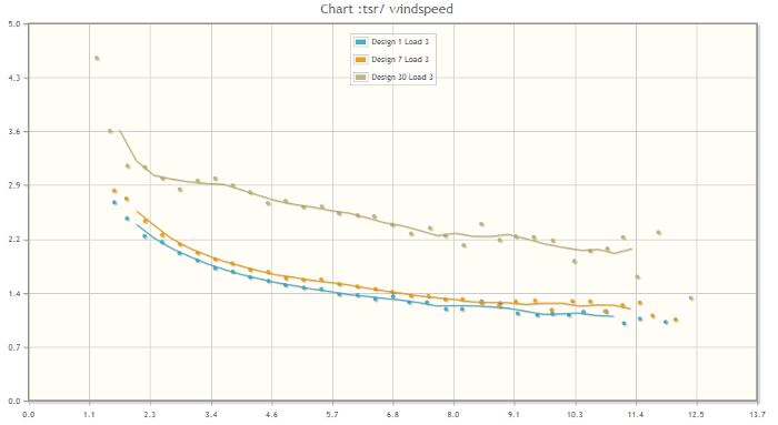
 The next step was to take the CSV output files and dump them into a MySql database and run SQL queries on the data. This allows the data to be filtered (e.g. to remove all points below start up speed or outliers) and grouped to average similar values. A couple of example graphs are below showing the power output and tip speed ratio (TSR) of some of the small vertical axis wind turbine designs. The lines on the graph are a running average between the data points. Vertical axis wind turbine (VAWT) output power against wind power. The efficiency is about 10%  VAWT tip speed ratio against wind speed  There is still a lot of work to be done interpreting the results and it would be good to have more data points at higher wind speeds. Where there are a large number of data points they tend to average to a consistent value. It would also be good to test the turbines in an environment with a steadier wind to see if the efficiency improves. |